Immigrants from Kenya vs New Zealander Male Poverty
COMPARE
Immigrants from Kenya
New Zealander
Male Poverty
Male Poverty Comparison
Immigrants from Kenya
New Zealanders
11.6%
MALE POVERTY
16.1/ 100
METRIC RATING
194th/ 347
METRIC RANK
10.8%
MALE POVERTY
82.9/ 100
METRIC RATING
134th/ 347
METRIC RANK
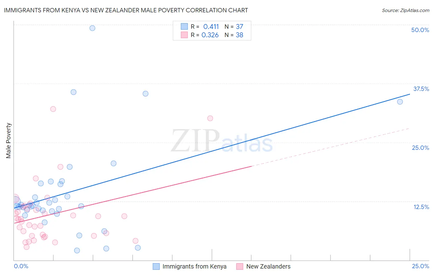
Immigrants from Kenya vs New Zealander Male Poverty Correlation Chart
The statistical analysis conducted on geographies consisting of 217,973,152 people shows a moderate positive correlation between the proportion of Immigrants from Kenya and poverty level among males in the United States with a correlation coefficient (R) of 0.411 and weighted average of 11.6%. Similarly, the statistical analysis conducted on geographies consisting of 106,891,318 people shows a mild positive correlation between the proportion of New Zealanders and poverty level among males in the United States with a correlation coefficient (R) of 0.326 and weighted average of 10.8%, a difference of 8.2%.
Male Poverty Correlation Summary
| Measurement | Immigrants from Kenya | New Zealander |
| Minimum | 2.1% | 2.8% |
| Maximum | 49.2% | 32.1% |
| Range | 47.2% | 29.3% |
| Mean | 14.3% | 9.6% |
| Median | 11.5% | 8.7% |
| Interquartile 25% (IQ1) | 10.5% | 5.1% |
| Interquartile 75% (IQ3) | 16.2% | 10.9% |
| Interquartile Range (IQR) | 5.7% | 5.7% |
| Standard Deviation (Sample) | 9.7% | 6.4% |
| Standard Deviation (Population) | 9.6% | 6.3% |
Similar Demographics by Male Poverty
Demographics Similar to Immigrants from Kenya by Male Poverty
In terms of male poverty, the demographic groups most similar to Immigrants from Kenya are Arab (11.6%, a difference of 0.050%), Hmong (11.6%, a difference of 0.050%), Delaware (11.7%, a difference of 0.12%), Immigrants from Kuwait (11.6%, a difference of 0.21%), and Iraqi (11.7%, a difference of 0.25%).
| Demographics | Rating | Rank | Male Poverty |
| Immigrants | Iraq | 31.9 /100 | #187 | Fair 11.4% |
| Sierra Leoneans | 29.9 /100 | #188 | Fair 11.4% |
| Hawaiians | 28.3 /100 | #189 | Fair 11.4% |
| Israelis | 26.1 /100 | #190 | Fair 11.5% |
| South American Indians | 22.8 /100 | #191 | Fair 11.5% |
| Immigrants | Uruguay | 19.1 /100 | #192 | Poor 11.6% |
| Immigrants | Kuwait | 17.3 /100 | #193 | Poor 11.6% |
| Immigrants | Kenya | 16.1 /100 | #194 | Poor 11.6% |
| Arabs | 15.8 /100 | #195 | Poor 11.6% |
| Hmong | 15.8 /100 | #196 | Poor 11.6% |
| Delaware | 15.4 /100 | #197 | Poor 11.7% |
| Iraqis | 14.7 /100 | #198 | Poor 11.7% |
| Spanish | 14.1 /100 | #199 | Poor 11.7% |
| Immigrants | Lebanon | 13.6 /100 | #200 | Poor 11.7% |
| Spaniards | 13.5 /100 | #201 | Poor 11.7% |
Demographics Similar to New Zealanders by Male Poverty
In terms of male poverty, the demographic groups most similar to New Zealanders are Pakistani (10.8%, a difference of 0.010%), Immigrants from Vietnam (10.8%, a difference of 0.020%), Brazilian (10.8%, a difference of 0.040%), Immigrants from Belarus (10.7%, a difference of 0.070%), and Chilean (10.7%, a difference of 0.18%).
| Demographics | Rating | Rank | Male Poverty |
| Puget Sound Salish | 84.3 /100 | #127 | Excellent 10.7% |
| Immigrants | Western Europe | 84.2 /100 | #128 | Excellent 10.7% |
| Immigrants | Peru | 84.1 /100 | #129 | Excellent 10.7% |
| Chileans | 83.9 /100 | #130 | Excellent 10.7% |
| Immigrants | Belarus | 83.3 /100 | #131 | Excellent 10.7% |
| Immigrants | Vietnam | 83.0 /100 | #132 | Excellent 10.8% |
| Pakistanis | 83.0 /100 | #133 | Excellent 10.8% |
| New Zealanders | 82.9 /100 | #134 | Excellent 10.8% |
| Brazilians | 82.7 /100 | #135 | Excellent 10.8% |
| Immigrants | Israel | 80.9 /100 | #136 | Excellent 10.8% |
| Immigrants | Switzerland | 79.2 /100 | #137 | Good 10.8% |
| Yugoslavians | 78.2 /100 | #138 | Good 10.8% |
| Immigrants | Jordan | 77.5 /100 | #139 | Good 10.8% |
| Tlingit-Haida | 76.1 /100 | #140 | Good 10.9% |
| Immigrants | France | 75.8 /100 | #141 | Good 10.9% |