Immigrants from Eastern Africa vs Immigrants from Israel Married-Couple Family Poverty
COMPARE
Immigrants from Eastern Africa
Immigrants from Israel
Married-Couple Family Poverty
Married-Couple Family Poverty Comparison
Immigrants from Eastern Africa
Immigrants from Israel
5.2%
MARRIED-COUPLE FAMILY POVERTY
50.0/ 100
METRIC RATING
174th/ 347
METRIC RANK
5.4%
MARRIED-COUPLE FAMILY POVERTY
27.8/ 100
METRIC RATING
194th/ 347
METRIC RANK
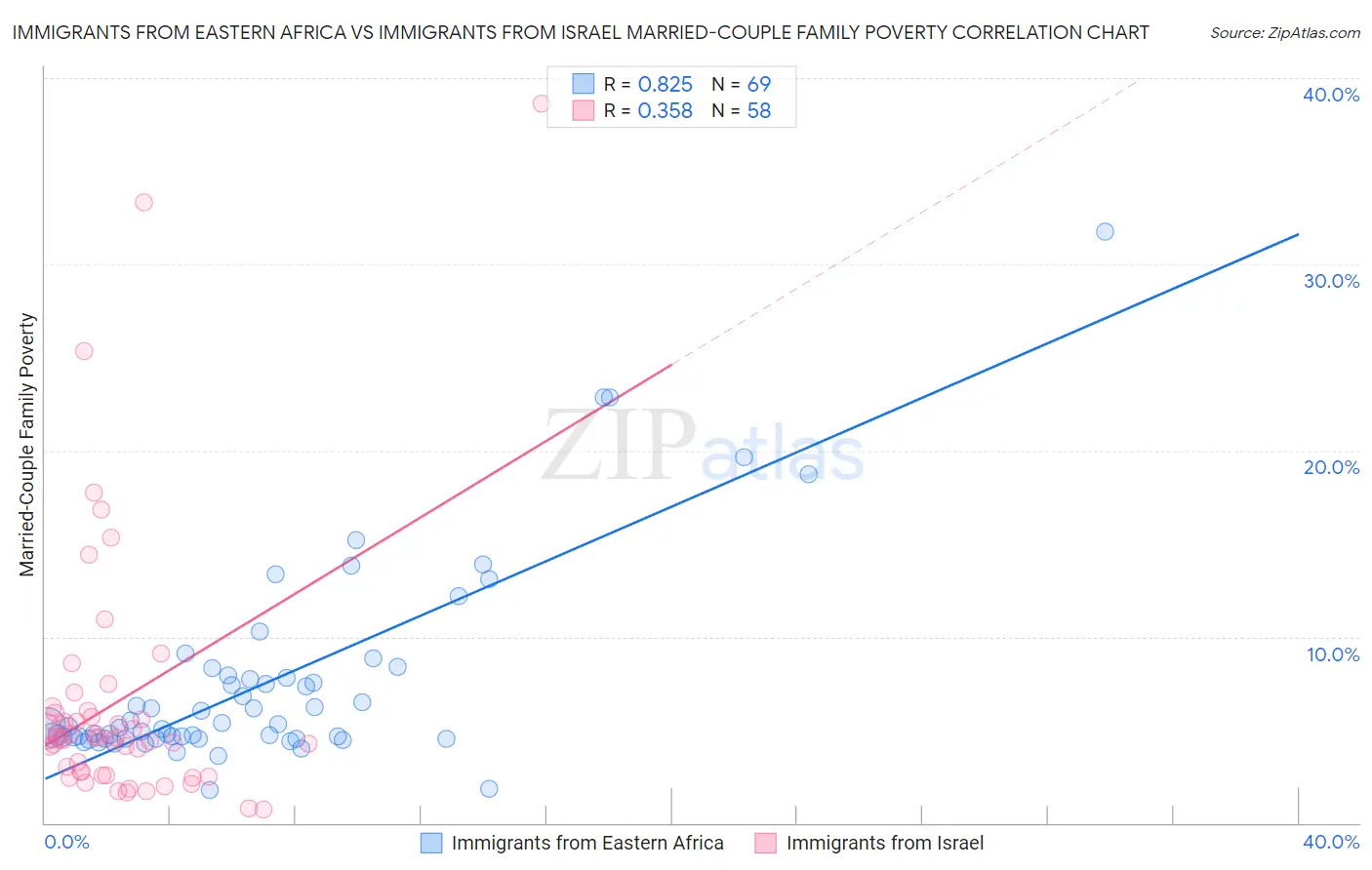
Immigrants from Eastern Africa vs Immigrants from Israel Married-Couple Family Poverty Correlation Chart
The statistical analysis conducted on geographies consisting of 352,572,169 people shows a very strong positive correlation between the proportion of Immigrants from Eastern Africa and poverty level among married-couple families in the United States with a correlation coefficient (R) of 0.825 and weighted average of 5.2%. Similarly, the statistical analysis conducted on geographies consisting of 209,060,562 people shows a mild positive correlation between the proportion of Immigrants from Israel and poverty level among married-couple families in the United States with a correlation coefficient (R) of 0.358 and weighted average of 5.4%, a difference of 2.8%.
Married-Couple Family Poverty Correlation Summary
| Measurement | Immigrants from Eastern Africa | Immigrants from Israel |
| Minimum | 1.7% | 0.74% |
| Maximum | 31.7% | 38.6% |
| Range | 30.0% | 37.9% |
| Mean | 7.5% | 6.5% |
| Median | 5.2% | 4.5% |
| Interquartile 25% (IQ1) | 4.5% | 2.7% |
| Interquartile 75% (IQ3) | 7.8% | 5.9% |
| Interquartile Range (IQR) | 3.3% | 3.2% |
| Standard Deviation (Sample) | 5.4% | 7.2% |
| Standard Deviation (Population) | 5.3% | 7.1% |
Demographics Similar to Immigrants from Eastern Africa and Immigrants from Israel by Married-Couple Family Poverty
In terms of married-couple family poverty, the demographic groups most similar to Immigrants from Eastern Africa are Marshallese (5.2%, a difference of 0.24%), Menominee (5.2%, a difference of 0.25%), Immigrants from Kazakhstan (5.2%, a difference of 0.57%), Immigrants from Ukraine (5.2%, a difference of 0.59%), and Spanish (5.3%, a difference of 1.0%). Similarly, the demographic groups most similar to Immigrants from Israel are Malaysian (5.4%, a difference of 0.22%), Cape Verdean (5.3%, a difference of 0.39%), Immigrants from Cabo Verde (5.3%, a difference of 0.42%), Ugandan (5.3%, a difference of 0.51%), and South American Indian (5.3%, a difference of 0.62%).
| Demographics | Rating | Rank | Married-Couple Family Poverty |
| Immigrants | Eastern Africa | 50.0 /100 | #174 | Average 5.2% |
| Marshallese | 47.9 /100 | #175 | Average 5.2% |
| Menominee | 47.8 /100 | #176 | Average 5.2% |
| Immigrants | Kazakhstan | 45.1 /100 | #177 | Average 5.2% |
| Immigrants | Ukraine | 44.9 /100 | #178 | Average 5.2% |
| Spanish | 41.4 /100 | #179 | Average 5.3% |
| Immigrants | Sierra Leone | 39.3 /100 | #180 | Fair 5.3% |
| Immigrants | Chile | 38.8 /100 | #181 | Fair 5.3% |
| Immigrants | Vietnam | 37.7 /100 | #182 | Fair 5.3% |
| Peruvians | 37.6 /100 | #183 | Fair 5.3% |
| Immigrants | Nonimmigrants | 35.8 /100 | #184 | Fair 5.3% |
| Americans | 35.4 /100 | #185 | Fair 5.3% |
| Hungarians | 34.7 /100 | #186 | Fair 5.3% |
| Immigrants | Albania | 33.8 /100 | #187 | Fair 5.3% |
| Israelis | 33.1 /100 | #188 | Fair 5.3% |
| South American Indians | 32.5 /100 | #189 | Fair 5.3% |
| Ugandans | 31.6 /100 | #190 | Fair 5.3% |
| Immigrants | Cabo Verde | 30.9 /100 | #191 | Fair 5.3% |
| Cape Verdeans | 30.7 /100 | #192 | Fair 5.3% |
| Malaysians | 29.5 /100 | #193 | Fair 5.4% |
| Immigrants | Israel | 27.8 /100 | #194 | Fair 5.4% |