Immigrants from Serbia vs Slavic Family Households
COMPARE
Immigrants from Serbia
Slavic
Family Households
Family Households Comparison
Immigrants from Serbia
Slavs
61.6%
FAMILY HOUSEHOLDS
0.0/ 100
METRIC RATING
322nd/ 347
METRIC RANK
64.0%
FAMILY HOUSEHOLDS
18.6/ 100
METRIC RATING
199th/ 347
METRIC RANK
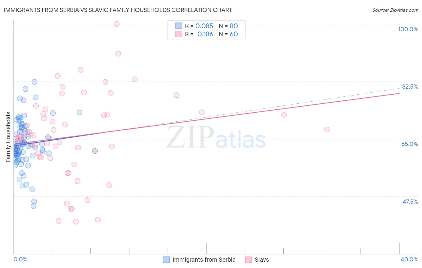
Immigrants from Serbia vs Slavic Family Households Correlation Chart
The statistical analysis conducted on geographies consisting of 131,724,151 people shows a slight positive correlation between the proportion of Immigrants from Serbia and percentage of family households in the United States with a correlation coefficient (R) of 0.085 and weighted average of 61.6%. Similarly, the statistical analysis conducted on geographies consisting of 270,816,335 people shows a poor positive correlation between the proportion of Slavs and percentage of family households in the United States with a correlation coefficient (R) of 0.186 and weighted average of 64.0%, a difference of 3.8%.
Family Households Correlation Summary
| Measurement | Immigrants from Serbia | Slavic |
| Minimum | 44.5% | 39.7% |
| Maximum | 82.3% | 100.0% |
| Range | 37.8% | 60.3% |
| Mean | 63.4% | 65.7% |
| Median | 62.6% | 65.4% |
| Interquartile 25% (IQ1) | 60.2% | 60.1% |
| Interquartile 75% (IQ3) | 67.5% | 72.4% |
| Interquartile Range (IQR) | 7.3% | 12.4% |
| Standard Deviation (Sample) | 7.0% | 12.5% |
| Standard Deviation (Population) | 7.0% | 12.4% |
Similar Demographics by Family Households
Demographics Similar to Immigrants from Serbia by Family Households
In terms of family households, the demographic groups most similar to Immigrants from Serbia are Tlingit-Haida (61.6%, a difference of 0.010%), Immigrants from West Indies (61.6%, a difference of 0.010%), Immigrants from Switzerland (61.6%, a difference of 0.020%), Alsatian (61.7%, a difference of 0.090%), and Ugandan (61.7%, a difference of 0.14%).
| Demographics | Rating | Rank | Family Households |
| Moroccans | 0.0 /100 | #315 | Tragic 61.9% |
| Immigrants | Middle Africa | 0.0 /100 | #316 | Tragic 61.9% |
| Immigrants | Bosnia and Herzegovina | 0.0 /100 | #317 | Tragic 61.9% |
| Alaskan Athabascans | 0.0 /100 | #318 | Tragic 61.8% |
| Cape Verdeans | 0.0 /100 | #319 | Tragic 61.8% |
| Ugandans | 0.0 /100 | #320 | Tragic 61.7% |
| Alsatians | 0.0 /100 | #321 | Tragic 61.7% |
| Immigrants | Serbia | 0.0 /100 | #322 | Tragic 61.6% |
| Tlingit-Haida | 0.0 /100 | #323 | Tragic 61.6% |
| Immigrants | West Indies | 0.0 /100 | #324 | Tragic 61.6% |
| Immigrants | Switzerland | 0.0 /100 | #325 | Tragic 61.6% |
| Indonesians | 0.0 /100 | #326 | Tragic 61.5% |
| Blacks/African Americans | 0.0 /100 | #327 | Tragic 61.5% |
| Kiowa | 0.0 /100 | #328 | Tragic 61.4% |
| Cambodians | 0.0 /100 | #329 | Tragic 61.4% |
Demographics Similar to Slavs by Family Households
In terms of family households, the demographic groups most similar to Slavs are Immigrants from Canada (64.0%, a difference of 0.010%), Seminole (64.0%, a difference of 0.010%), Polish (64.0%, a difference of 0.010%), Immigrants from Malaysia (64.0%, a difference of 0.020%), and Immigrants from North America (64.0%, a difference of 0.030%).
| Demographics | Rating | Rank | Family Households |
| Lithuanians | 23.8 /100 | #192 | Fair 64.0% |
| French | 23.7 /100 | #193 | Fair 64.0% |
| Paiute | 22.2 /100 | #194 | Fair 64.0% |
| Immigrants | North America | 20.0 /100 | #195 | Poor 64.0% |
| Immigrants | Canada | 19.2 /100 | #196 | Poor 64.0% |
| Seminole | 18.9 /100 | #197 | Poor 64.0% |
| Poles | 18.9 /100 | #198 | Poor 64.0% |
| Slavs | 18.6 /100 | #199 | Poor 64.0% |
| Immigrants | Malaysia | 17.9 /100 | #200 | Poor 64.0% |
| Immigrants | Eastern Europe | 17.2 /100 | #201 | Poor 64.0% |
| Iranians | 13.5 /100 | #202 | Poor 63.9% |
| Norwegians | 13.2 /100 | #203 | Poor 63.9% |
| Immigrants | Uruguay | 12.8 /100 | #204 | Poor 63.9% |
| Brazilians | 12.4 /100 | #205 | Poor 63.9% |
| Immigrants | Lithuania | 12.1 /100 | #206 | Poor 63.9% |