Immigrants from Middle Africa vs Immigrants from South Eastern Asia Female Unemployment
COMPARE
Immigrants from Middle Africa
Immigrants from South Eastern Asia
Female Unemployment
Female Unemployment Comparison
Immigrants from Middle Africa
Immigrants from South Eastern Asia
5.4%
FEMALE UNEMPLOYMENT
20.8/ 100
METRIC RATING
201st/ 347
METRIC RANK
5.4%
FEMALE UNEMPLOYMENT
20.3/ 100
METRIC RATING
203rd/ 347
METRIC RANK
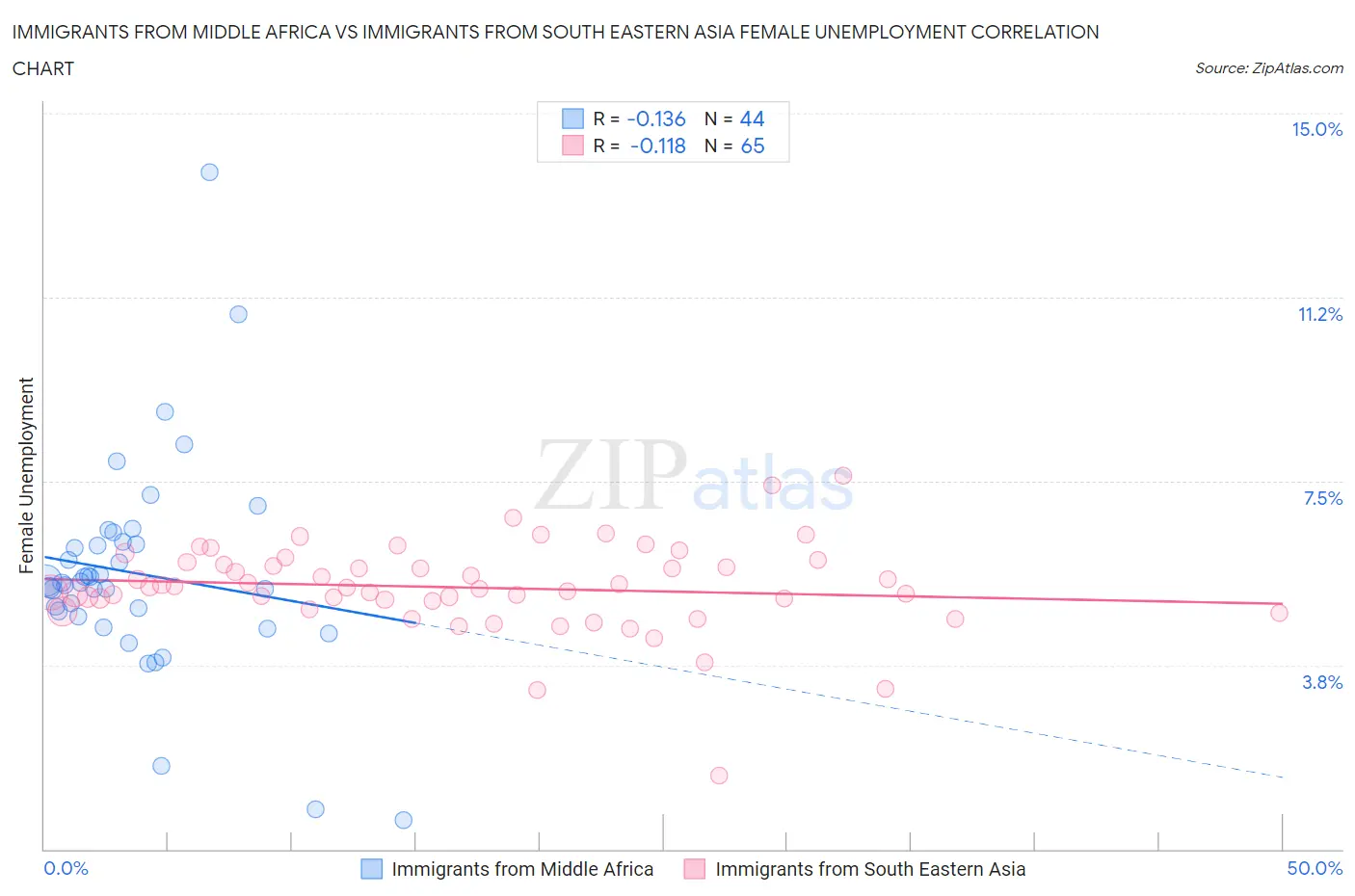
Immigrants from Middle Africa vs Immigrants from South Eastern Asia Female Unemployment Correlation Chart
The statistical analysis conducted on geographies consisting of 202,480,571 people shows a poor negative correlation between the proportion of Immigrants from Middle Africa and unemploymnet rate among females in the United States with a correlation coefficient (R) of -0.136 and weighted average of 5.4%. Similarly, the statistical analysis conducted on geographies consisting of 507,584,627 people shows a poor negative correlation between the proportion of Immigrants from South Eastern Asia and unemploymnet rate among females in the United States with a correlation coefficient (R) of -0.118 and weighted average of 5.4%, a difference of 0.040%.
Female Unemployment Correlation Summary
| Measurement | Immigrants from Middle Africa | Immigrants from South Eastern Asia |
| Minimum | 0.60% | 1.5% |
| Maximum | 13.8% | 7.6% |
| Range | 13.2% | 6.1% |
| Mean | 5.6% | 5.3% |
| Median | 5.4% | 5.3% |
| Interquartile 25% (IQ1) | 4.8% | 5.0% |
| Interquartile 75% (IQ3) | 6.2% | 5.8% |
| Interquartile Range (IQR) | 1.4% | 0.85% |
| Standard Deviation (Sample) | 2.2% | 0.92% |
| Standard Deviation (Population) | 2.2% | 0.91% |
Demographics Similar to Immigrants from Middle Africa and Immigrants from South Eastern Asia by Female Unemployment
In terms of female unemployment, the demographic groups most similar to Immigrants from Middle Africa are Iroquois (5.4%, a difference of 0.0%), Soviet Union (5.4%, a difference of 0.080%), Immigrants from Israel (5.4%, a difference of 0.10%), Hawaiian (5.4%, a difference of 0.12%), and Immigrants from Afghanistan (5.4%, a difference of 0.18%). Similarly, the demographic groups most similar to Immigrants from South Eastern Asia are Iroquois (5.4%, a difference of 0.040%), Immigrants from Israel (5.4%, a difference of 0.060%), Soviet Union (5.4%, a difference of 0.12%), Immigrants from Afghanistan (5.4%, a difference of 0.13%), and Immigrants from Brazil (5.4%, a difference of 0.15%).
| Demographics | Rating | Rank | Female Unemployment |
| Portuguese | 28.6 /100 | #192 | Fair 5.3% |
| Arabs | 27.7 /100 | #193 | Fair 5.3% |
| Colombians | 27.0 /100 | #194 | Fair 5.3% |
| Immigrants | Colombia | 26.2 /100 | #195 | Fair 5.3% |
| Spaniards | 25.2 /100 | #196 | Fair 5.3% |
| Alsatians | 23.9 /100 | #197 | Fair 5.3% |
| Tsimshian | 23.1 /100 | #198 | Fair 5.4% |
| Hawaiians | 22.2 /100 | #199 | Fair 5.4% |
| Soviet Union | 21.7 /100 | #200 | Fair 5.4% |
| Immigrants | Middle Africa | 20.8 /100 | #201 | Fair 5.4% |
| Iroquois | 20.8 /100 | #202 | Fair 5.4% |
| Immigrants | South Eastern Asia | 20.3 /100 | #203 | Fair 5.4% |
| Immigrants | Israel | 19.7 /100 | #204 | Poor 5.4% |
| Immigrants | Afghanistan | 18.9 /100 | #205 | Poor 5.4% |
| Immigrants | Brazil | 18.8 /100 | #206 | Poor 5.4% |
| Creek | 15.4 /100 | #207 | Poor 5.4% |
| Immigrants | Costa Rica | 13.7 /100 | #208 | Poor 5.4% |
| Koreans | 13.4 /100 | #209 | Poor 5.4% |
| Choctaw | 12.3 /100 | #210 | Poor 5.4% |
| Ottawa | 11.6 /100 | #211 | Poor 5.4% |
| Uruguayans | 11.4 /100 | #212 | Poor 5.4% |