Immigrants from Uruguay vs Indonesian Family Households
COMPARE
Immigrants from Uruguay
Indonesian
Family Households
Family Households Comparison
Immigrants from Uruguay
Indonesians
63.9%
FAMILY HOUSEHOLDS
12.8/ 100
METRIC RATING
204th/ 347
METRIC RANK
61.5%
FAMILY HOUSEHOLDS
0.0/ 100
METRIC RATING
326th/ 347
METRIC RANK
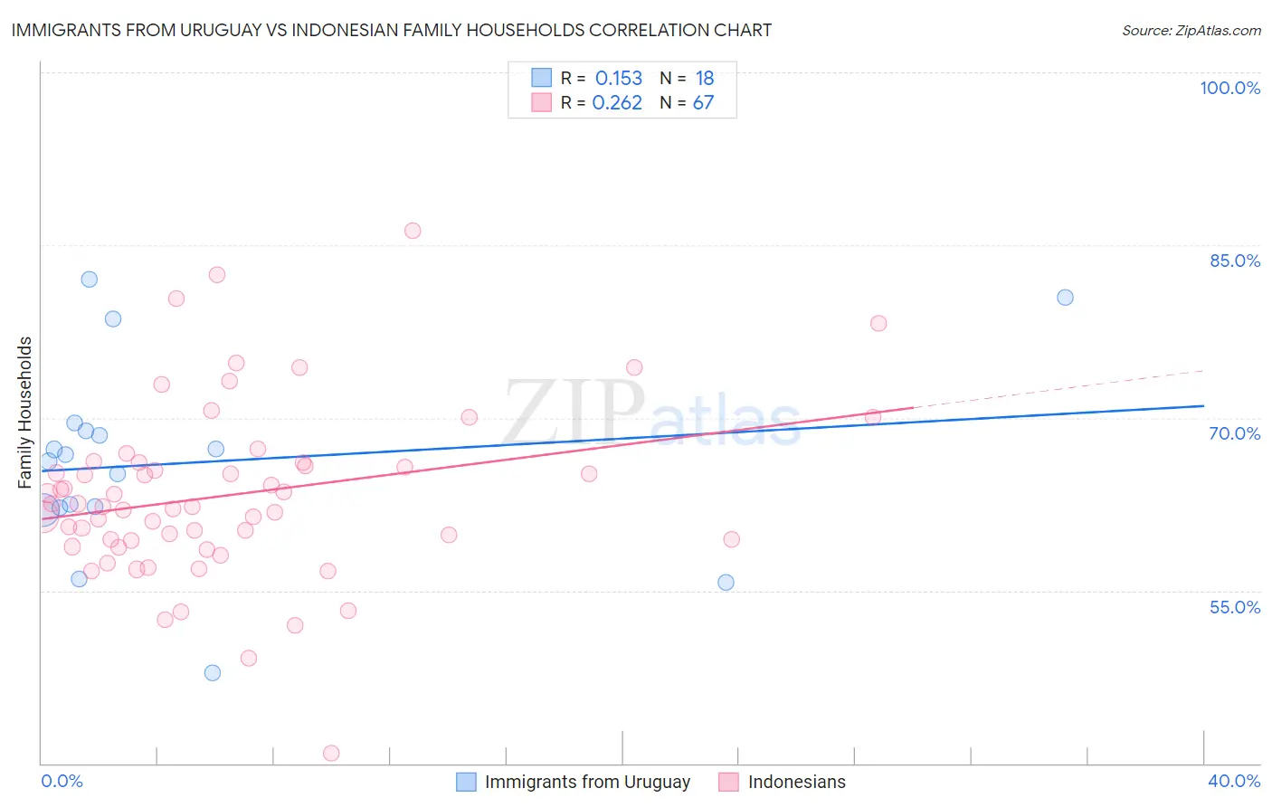
Immigrants from Uruguay vs Indonesian Family Households Correlation Chart
The statistical analysis conducted on geographies consisting of 133,245,142 people shows a poor positive correlation between the proportion of Immigrants from Uruguay and percentage of family households in the United States with a correlation coefficient (R) of 0.153 and weighted average of 63.9%. Similarly, the statistical analysis conducted on geographies consisting of 162,647,758 people shows a weak positive correlation between the proportion of Indonesians and percentage of family households in the United States with a correlation coefficient (R) of 0.262 and weighted average of 61.5%, a difference of 3.9%.
Family Households Correlation Summary
| Measurement | Immigrants from Uruguay | Indonesian |
| Minimum | 47.9% | 40.9% |
| Maximum | 82.0% | 86.2% |
| Range | 34.1% | 45.3% |
| Mean | 66.1% | 63.3% |
| Median | 66.5% | 62.3% |
| Interquartile 25% (IQ1) | 62.2% | 59.4% |
| Interquartile 75% (IQ3) | 68.9% | 66.1% |
| Interquartile Range (IQR) | 6.7% | 6.7% |
| Standard Deviation (Sample) | 8.6% | 7.6% |
| Standard Deviation (Population) | 8.3% | 7.6% |
Similar Demographics by Family Households
Demographics Similar to Immigrants from Uruguay by Family Households
In terms of family households, the demographic groups most similar to Immigrants from Uruguay are Norwegian (63.9%, a difference of 0.010%), Brazilian (63.9%, a difference of 0.010%), Iranian (63.9%, a difference of 0.020%), Immigrants from Lithuania (63.9%, a difference of 0.020%), and Nigerian (63.9%, a difference of 0.040%).
| Demographics | Rating | Rank | Family Households |
| Seminole | 18.9 /100 | #197 | Poor 64.0% |
| Poles | 18.9 /100 | #198 | Poor 64.0% |
| Slavs | 18.6 /100 | #199 | Poor 64.0% |
| Immigrants | Malaysia | 17.9 /100 | #200 | Poor 64.0% |
| Immigrants | Eastern Europe | 17.2 /100 | #201 | Poor 64.0% |
| Iranians | 13.5 /100 | #202 | Poor 63.9% |
| Norwegians | 13.2 /100 | #203 | Poor 63.9% |
| Immigrants | Uruguay | 12.8 /100 | #204 | Poor 63.9% |
| Brazilians | 12.4 /100 | #205 | Poor 63.9% |
| Immigrants | Lithuania | 12.1 /100 | #206 | Poor 63.9% |
| Nigerians | 11.5 /100 | #207 | Poor 63.9% |
| Immigrants | Bangladesh | 11.4 /100 | #208 | Poor 63.9% |
| Sierra Leoneans | 11.2 /100 | #209 | Poor 63.9% |
| Immigrants | Thailand | 9.6 /100 | #210 | Tragic 63.8% |
| Shoshone | 9.4 /100 | #211 | Tragic 63.8% |
Demographics Similar to Indonesians by Family Households
In terms of family households, the demographic groups most similar to Indonesians are Black/African American (61.5%, a difference of 0.020%), Kiowa (61.4%, a difference of 0.15%), Cambodian (61.4%, a difference of 0.18%), Immigrants from Switzerland (61.6%, a difference of 0.19%), and Immigrants from West Indies (61.6%, a difference of 0.20%).
| Demographics | Rating | Rank | Family Households |
| Cape Verdeans | 0.0 /100 | #319 | Tragic 61.8% |
| Ugandans | 0.0 /100 | #320 | Tragic 61.7% |
| Alsatians | 0.0 /100 | #321 | Tragic 61.7% |
| Immigrants | Serbia | 0.0 /100 | #322 | Tragic 61.6% |
| Tlingit-Haida | 0.0 /100 | #323 | Tragic 61.6% |
| Immigrants | West Indies | 0.0 /100 | #324 | Tragic 61.6% |
| Immigrants | Switzerland | 0.0 /100 | #325 | Tragic 61.6% |
| Indonesians | 0.0 /100 | #326 | Tragic 61.5% |
| Blacks/African Americans | 0.0 /100 | #327 | Tragic 61.5% |
| Kiowa | 0.0 /100 | #328 | Tragic 61.4% |
| Cambodians | 0.0 /100 | #329 | Tragic 61.4% |
| Immigrants | Australia | 0.0 /100 | #330 | Tragic 61.3% |
| Immigrants | France | 0.0 /100 | #331 | Tragic 61.3% |
| Ethiopians | 0.0 /100 | #332 | Tragic 61.2% |
| Immigrants | Ethiopia | 0.0 /100 | #333 | Tragic 61.2% |