Immigrants from North America vs Black/African American Family Households
COMPARE
Immigrants from North America
Black/African American
Family Households
Family Households Comparison
Immigrants from North America
Blacks/African Americans
64.0%
FAMILY HOUSEHOLDS
20.0/ 100
METRIC RATING
195th/ 347
METRIC RANK
61.5%
FAMILY HOUSEHOLDS
0.0/ 100
METRIC RATING
327th/ 347
METRIC RANK
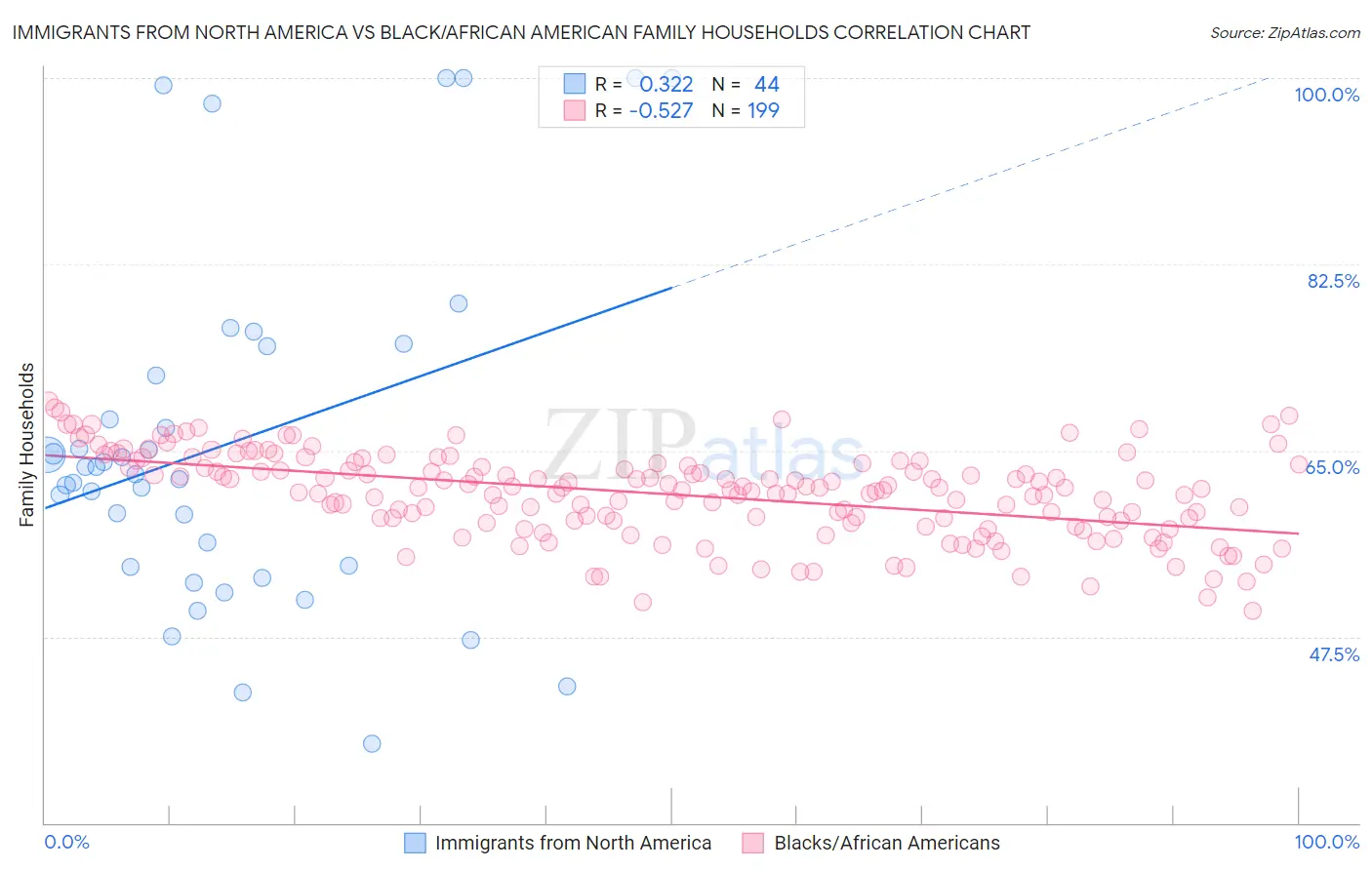
Immigrants from North America vs Black/African American Family Households Correlation Chart
The statistical analysis conducted on geographies consisting of 462,193,298 people shows a mild positive correlation between the proportion of Immigrants from North America and percentage of family households in the United States with a correlation coefficient (R) of 0.322 and weighted average of 64.0%. Similarly, the statistical analysis conducted on geographies consisting of 565,332,954 people shows a substantial negative correlation between the proportion of Blacks/African Americans and percentage of family households in the United States with a correlation coefficient (R) of -0.527 and weighted average of 61.5%, a difference of 4.1%.
Family Households Correlation Summary
| Measurement | Immigrants from North America | Black/African American |
| Minimum | 37.5% | 49.9% |
| Maximum | 100.0% | 69.6% |
| Range | 62.5% | 19.8% |
| Mean | 65.7% | 60.9% |
| Median | 63.1% | 61.4% |
| Interquartile 25% (IQ1) | 54.1% | 58.4% |
| Interquartile 75% (IQ3) | 73.4% | 63.8% |
| Interquartile Range (IQR) | 19.3% | 5.4% |
| Standard Deviation (Sample) | 16.4% | 4.0% |
| Standard Deviation (Population) | 16.2% | 4.0% |
Similar Demographics by Family Households
Demographics Similar to Immigrants from North America by Family Households
In terms of family households, the demographic groups most similar to Immigrants from North America are Immigrants from Canada (64.0%, a difference of 0.020%), Seminole (64.0%, a difference of 0.020%), Polish (64.0%, a difference of 0.020%), Slavic (64.0%, a difference of 0.030%), and Paiute (64.0%, a difference of 0.040%).
| Demographics | Rating | Rank | Family Households |
| Paraguayans | 26.7 /100 | #188 | Fair 64.1% |
| Immigrants | Western Asia | 25.3 /100 | #189 | Fair 64.1% |
| Zimbabweans | 24.7 /100 | #190 | Fair 64.1% |
| Arabs | 24.5 /100 | #191 | Fair 64.1% |
| Lithuanians | 23.8 /100 | #192 | Fair 64.0% |
| French | 23.7 /100 | #193 | Fair 64.0% |
| Paiute | 22.2 /100 | #194 | Fair 64.0% |
| Immigrants | North America | 20.0 /100 | #195 | Poor 64.0% |
| Immigrants | Canada | 19.2 /100 | #196 | Poor 64.0% |
| Seminole | 18.9 /100 | #197 | Poor 64.0% |
| Poles | 18.9 /100 | #198 | Poor 64.0% |
| Slavs | 18.6 /100 | #199 | Poor 64.0% |
| Immigrants | Malaysia | 17.9 /100 | #200 | Poor 64.0% |
| Immigrants | Eastern Europe | 17.2 /100 | #201 | Poor 64.0% |
| Iranians | 13.5 /100 | #202 | Poor 63.9% |
Demographics Similar to Blacks/African Americans by Family Households
In terms of family households, the demographic groups most similar to Blacks/African Americans are Indonesian (61.5%, a difference of 0.020%), Kiowa (61.4%, a difference of 0.13%), Cambodian (61.4%, a difference of 0.15%), Immigrants from Switzerland (61.6%, a difference of 0.21%), and Immigrants from West Indies (61.6%, a difference of 0.22%).
| Demographics | Rating | Rank | Family Households |
| Ugandans | 0.0 /100 | #320 | Tragic 61.7% |
| Alsatians | 0.0 /100 | #321 | Tragic 61.7% |
| Immigrants | Serbia | 0.0 /100 | #322 | Tragic 61.6% |
| Tlingit-Haida | 0.0 /100 | #323 | Tragic 61.6% |
| Immigrants | West Indies | 0.0 /100 | #324 | Tragic 61.6% |
| Immigrants | Switzerland | 0.0 /100 | #325 | Tragic 61.6% |
| Indonesians | 0.0 /100 | #326 | Tragic 61.5% |
| Blacks/African Americans | 0.0 /100 | #327 | Tragic 61.5% |
| Kiowa | 0.0 /100 | #328 | Tragic 61.4% |
| Cambodians | 0.0 /100 | #329 | Tragic 61.4% |
| Immigrants | Australia | 0.0 /100 | #330 | Tragic 61.3% |
| Immigrants | France | 0.0 /100 | #331 | Tragic 61.3% |
| Ethiopians | 0.0 /100 | #332 | Tragic 61.2% |
| Immigrants | Ethiopia | 0.0 /100 | #333 | Tragic 61.2% |
| Immigrants | Eastern Africa | 0.0 /100 | #334 | Tragic 61.1% |