Immigrants from Uganda vs Black/African American Family Households
COMPARE
Immigrants from Uganda
Black/African American
Family Households
Family Households Comparison
Immigrants from Uganda
Blacks/African Americans
62.7%
FAMILY HOUSEHOLDS
0.1/ 100
METRIC RATING
288th/ 347
METRIC RANK
61.5%
FAMILY HOUSEHOLDS
0.0/ 100
METRIC RATING
327th/ 347
METRIC RANK
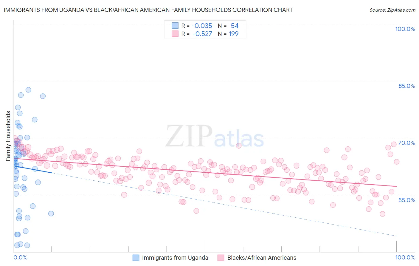
Immigrants from Uganda vs Black/African American Family Households Correlation Chart
The statistical analysis conducted on geographies consisting of 125,974,849 people shows no correlation between the proportion of Immigrants from Uganda and percentage of family households in the United States with a correlation coefficient (R) of -0.035 and weighted average of 62.7%. Similarly, the statistical analysis conducted on geographies consisting of 565,332,954 people shows a substantial negative correlation between the proportion of Blacks/African Americans and percentage of family households in the United States with a correlation coefficient (R) of -0.527 and weighted average of 61.5%, a difference of 2.1%.
Family Households Correlation Summary
| Measurement | Immigrants from Uganda | Black/African American |
| Minimum | 41.7% | 49.9% |
| Maximum | 82.6% | 69.6% |
| Range | 40.9% | 19.8% |
| Mean | 62.2% | 60.9% |
| Median | 63.9% | 61.4% |
| Interquartile 25% (IQ1) | 56.5% | 58.4% |
| Interquartile 75% (IQ3) | 68.3% | 63.8% |
| Interquartile Range (IQR) | 11.9% | 5.4% |
| Standard Deviation (Sample) | 10.5% | 4.0% |
| Standard Deviation (Population) | 10.4% | 4.0% |
Similar Demographics by Family Households
Demographics Similar to Immigrants from Uganda by Family Households
In terms of family households, the demographic groups most similar to Immigrants from Uganda are British West Indian (62.8%, a difference of 0.020%), Latvian (62.8%, a difference of 0.020%), Mongolian (62.8%, a difference of 0.050%), Immigrants from Nepal (62.7%, a difference of 0.090%), and Australian (62.8%, a difference of 0.16%).
| Demographics | Rating | Rank | Family Households |
| Estonians | 0.2 /100 | #281 | Tragic 62.9% |
| New Zealanders | 0.1 /100 | #282 | Tragic 62.9% |
| Immigrants | Denmark | 0.1 /100 | #283 | Tragic 62.9% |
| Australians | 0.1 /100 | #284 | Tragic 62.8% |
| Mongolians | 0.1 /100 | #285 | Tragic 62.8% |
| British West Indians | 0.1 /100 | #286 | Tragic 62.8% |
| Latvians | 0.1 /100 | #287 | Tragic 62.8% |
| Immigrants | Uganda | 0.1 /100 | #288 | Tragic 62.7% |
| Immigrants | Nepal | 0.1 /100 | #289 | Tragic 62.7% |
| Immigrants | Grenada | 0.0 /100 | #290 | Tragic 62.6% |
| U.S. Virgin Islanders | 0.0 /100 | #291 | Tragic 62.6% |
| Immigrants | Burma/Myanmar | 0.0 /100 | #292 | Tragic 62.6% |
| Immigrants | Sweden | 0.0 /100 | #293 | Tragic 62.5% |
| Barbadians | 0.0 /100 | #294 | Tragic 62.5% |
| Okinawans | 0.0 /100 | #295 | Tragic 62.5% |
Demographics Similar to Blacks/African Americans by Family Households
In terms of family households, the demographic groups most similar to Blacks/African Americans are Indonesian (61.5%, a difference of 0.020%), Kiowa (61.4%, a difference of 0.13%), Cambodian (61.4%, a difference of 0.15%), Immigrants from Switzerland (61.6%, a difference of 0.21%), and Immigrants from West Indies (61.6%, a difference of 0.22%).
| Demographics | Rating | Rank | Family Households |
| Ugandans | 0.0 /100 | #320 | Tragic 61.7% |
| Alsatians | 0.0 /100 | #321 | Tragic 61.7% |
| Immigrants | Serbia | 0.0 /100 | #322 | Tragic 61.6% |
| Tlingit-Haida | 0.0 /100 | #323 | Tragic 61.6% |
| Immigrants | West Indies | 0.0 /100 | #324 | Tragic 61.6% |
| Immigrants | Switzerland | 0.0 /100 | #325 | Tragic 61.6% |
| Indonesians | 0.0 /100 | #326 | Tragic 61.5% |
| Blacks/African Americans | 0.0 /100 | #327 | Tragic 61.5% |
| Kiowa | 0.0 /100 | #328 | Tragic 61.4% |
| Cambodians | 0.0 /100 | #329 | Tragic 61.4% |
| Immigrants | Australia | 0.0 /100 | #330 | Tragic 61.3% |
| Immigrants | France | 0.0 /100 | #331 | Tragic 61.3% |
| Ethiopians | 0.0 /100 | #332 | Tragic 61.2% |
| Immigrants | Ethiopia | 0.0 /100 | #333 | Tragic 61.2% |
| Immigrants | Eastern Africa | 0.0 /100 | #334 | Tragic 61.1% |