Lebanese vs Immigrants from South Africa Single Female Poverty
COMPARE
Lebanese
Immigrants from South Africa
Single Female Poverty
Single Female Poverty Comparison
Lebanese
Immigrants from South Africa
20.8%
SINGLE FEMALE POVERTY
67.6/ 100
METRIC RATING
163rd/ 347
METRIC RANK
20.1%
SINGLE FEMALE POVERTY
93.9/ 100
METRIC RATING
125th/ 347
METRIC RANK
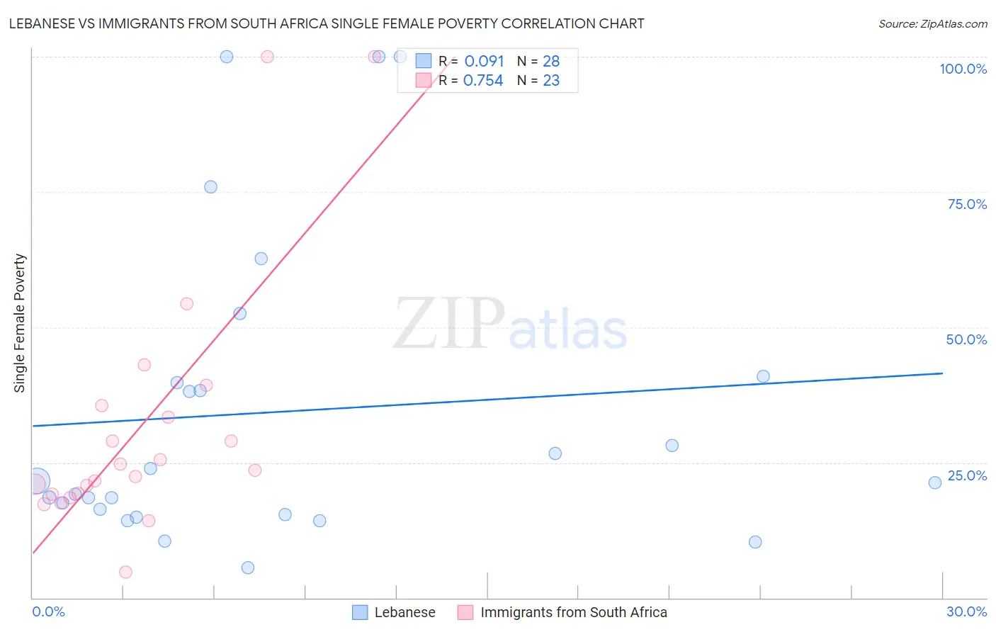
Lebanese vs Immigrants from South Africa Single Female Poverty Correlation Chart
The statistical analysis conducted on geographies consisting of 394,403,389 people shows a slight positive correlation between the proportion of Lebanese and poverty level among single females in the United States with a correlation coefficient (R) of 0.091 and weighted average of 20.8%. Similarly, the statistical analysis conducted on geographies consisting of 230,419,478 people shows a strong positive correlation between the proportion of Immigrants from South Africa and poverty level among single females in the United States with a correlation coefficient (R) of 0.754 and weighted average of 20.1%, a difference of 3.3%.
Single Female Poverty Correlation Summary
| Measurement | Lebanese | Immigrants from South Africa |
| Minimum | 5.5% | 4.7% |
| Maximum | 100.0% | 100.0% |
| Range | 94.5% | 95.3% |
| Mean | 34.4% | 31.9% |
| Median | 21.5% | 23.5% |
| Interquartile 25% (IQ1) | 15.8% | 19.1% |
| Interquartile 75% (IQ3) | 40.4% | 35.4% |
| Interquartile Range (IQR) | 24.6% | 16.3% |
| Standard Deviation (Sample) | 28.2% | 23.9% |
| Standard Deviation (Population) | 27.7% | 23.4% |
Similar Demographics by Single Female Poverty
Demographics Similar to Lebanese by Single Female Poverty
In terms of single female poverty, the demographic groups most similar to Lebanese are Northern European (20.8%, a difference of 0.050%), Kenyan (20.8%, a difference of 0.060%), Iraqi (20.8%, a difference of 0.22%), Arab (20.7%, a difference of 0.24%), and Ugandan (20.8%, a difference of 0.26%).
| Demographics | Rating | Rank | Single Female Poverty |
| South American Indians | 75.7 /100 | #156 | Good 20.6% |
| Immigrants | Oceania | 74.3 /100 | #157 | Good 20.7% |
| Danes | 73.0 /100 | #158 | Good 20.7% |
| Costa Ricans | 71.8 /100 | #159 | Good 20.7% |
| Arabs | 70.8 /100 | #160 | Good 20.7% |
| Kenyans | 68.5 /100 | #161 | Good 20.8% |
| Northern Europeans | 68.4 /100 | #162 | Good 20.8% |
| Lebanese | 67.6 /100 | #163 | Good 20.8% |
| Iraqis | 64.5 /100 | #164 | Good 20.8% |
| Ugandans | 64.0 /100 | #165 | Good 20.8% |
| Norwegians | 63.0 /100 | #166 | Good 20.8% |
| Immigrants | Norway | 63.0 /100 | #167 | Good 20.8% |
| Immigrants | Costa Rica | 61.5 /100 | #168 | Good 20.9% |
| Immigrants | Trinidad and Tobago | 56.3 /100 | #169 | Average 20.9% |
| New Zealanders | 53.2 /100 | #170 | Average 21.0% |
Demographics Similar to Immigrants from South Africa by Single Female Poverty
In terms of single female poverty, the demographic groups most similar to Immigrants from South Africa are Immigrants from Chile (20.1%, a difference of 0.12%), Brazilian (20.1%, a difference of 0.15%), Serbian (20.1%, a difference of 0.17%), Mongolian (20.2%, a difference of 0.19%), and Immigrants from Spain (20.2%, a difference of 0.31%).
| Demographics | Rating | Rank | Single Female Poverty |
| Immigrants | Afghanistan | 95.4 /100 | #118 | Exceptional 20.0% |
| Immigrants | Ethiopia | 95.4 /100 | #119 | Exceptional 20.0% |
| South Americans | 95.1 /100 | #120 | Exceptional 20.0% |
| Immigrants | Switzerland | 95.1 /100 | #121 | Exceptional 20.0% |
| Immigrants | South America | 95.0 /100 | #122 | Exceptional 20.0% |
| Brazilians | 94.4 /100 | #123 | Exceptional 20.1% |
| Immigrants | Chile | 94.3 /100 | #124 | Exceptional 20.1% |
| Immigrants | South Africa | 93.9 /100 | #125 | Exceptional 20.1% |
| Serbians | 93.3 /100 | #126 | Exceptional 20.1% |
| Mongolians | 93.2 /100 | #127 | Exceptional 20.2% |
| Immigrants | Spain | 92.7 /100 | #128 | Exceptional 20.2% |
| Immigrants | Morocco | 92.4 /100 | #129 | Exceptional 20.2% |
| Immigrants | Hungary | 92.3 /100 | #130 | Exceptional 20.2% |
| Pakistanis | 92.1 /100 | #131 | Exceptional 20.2% |
| Uruguayans | 92.1 /100 | #132 | Exceptional 20.2% |