Immigrants from Africa vs Kenyan Family Poverty
COMPARE
Immigrants from Africa
Kenyan
Family Poverty
Family Poverty Comparison
Immigrants from Africa
Kenyans
9.9%
FAMILY POVERTY
4.3/ 100
METRIC RATING
223rd/ 347
METRIC RANK
8.9%
FAMILY POVERTY
58.2/ 100
METRIC RATING
170th/ 347
METRIC RANK
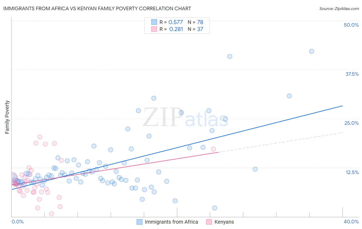
Immigrants from Africa vs Kenyan Family Poverty Correlation Chart
The statistical analysis conducted on geographies consisting of 467,521,718 people shows a substantial positive correlation between the proportion of Immigrants from Africa and poverty level among families in the United States with a correlation coefficient (R) of 0.577 and weighted average of 9.9%. Similarly, the statistical analysis conducted on geographies consisting of 168,038,695 people shows a weak positive correlation between the proportion of Kenyans and poverty level among families in the United States with a correlation coefficient (R) of 0.281 and weighted average of 8.9%, a difference of 11.3%.
Family Poverty Correlation Summary
| Measurement | Immigrants from Africa | Kenyan |
| Minimum | 2.2% | 0.77% |
| Maximum | 42.2% | 20.3% |
| Range | 40.0% | 19.5% |
| Mean | 13.1% | 9.1% |
| Median | 10.7% | 8.3% |
| Interquartile 25% (IQ1) | 8.9% | 6.2% |
| Interquartile 75% (IQ3) | 14.2% | 10.7% |
| Interquartile Range (IQR) | 5.3% | 4.5% |
| Standard Deviation (Sample) | 7.4% | 4.7% |
| Standard Deviation (Population) | 7.3% | 4.6% |
Similar Demographics by Family Poverty
Demographics Similar to Immigrants from Africa by Family Poverty
In terms of family poverty, the demographic groups most similar to Immigrants from Africa are Japanese (9.9%, a difference of 0.30%), Marshallese (9.9%, a difference of 0.30%), Immigrants from Cambodia (9.9%, a difference of 0.33%), Immigrants (10.0%, a difference of 0.55%), and Bermudan (9.9%, a difference of 0.61%).
| Demographics | Rating | Rank | Family Poverty |
| Moroccans | 6.5 /100 | #216 | Tragic 9.8% |
| Americans | 6.2 /100 | #217 | Tragic 9.8% |
| Panamanians | 5.6 /100 | #218 | Tragic 9.8% |
| Immigrants | Eritrea | 5.4 /100 | #219 | Tragic 9.9% |
| Bermudans | 5.3 /100 | #220 | Tragic 9.9% |
| Immigrants | Cambodia | 4.8 /100 | #221 | Tragic 9.9% |
| Japanese | 4.8 /100 | #222 | Tragic 9.9% |
| Immigrants | Africa | 4.3 /100 | #223 | Tragic 9.9% |
| Marshallese | 3.9 /100 | #224 | Tragic 9.9% |
| Immigrants | Immigrants | 3.6 /100 | #225 | Tragic 10.0% |
| Ottawa | 3.3 /100 | #226 | Tragic 10.0% |
| Immigrants | Armenia | 3.3 /100 | #227 | Tragic 10.0% |
| Sudanese | 3.1 /100 | #228 | Tragic 10.0% |
| Immigrants | Uzbekistan | 3.1 /100 | #229 | Tragic 10.0% |
| Immigrants | Panama | 3.1 /100 | #230 | Tragic 10.0% |
Demographics Similar to Kenyans by Family Poverty
In terms of family poverty, the demographic groups most similar to Kenyans are Lebanese (8.9%, a difference of 0.080%), Immigrants from Peru (8.9%, a difference of 0.090%), Immigrants from Chile (8.9%, a difference of 0.19%), Immigrants from Fiji (8.9%, a difference of 0.25%), and Israeli (8.9%, a difference of 0.54%).
| Demographics | Rating | Rank | Family Poverty |
| Pennsylvania Germans | 66.0 /100 | #163 | Good 8.8% |
| Celtics | 64.9 /100 | #164 | Good 8.8% |
| Guamanians/Chamorros | 64.7 /100 | #165 | Good 8.8% |
| Afghans | 63.5 /100 | #166 | Good 8.8% |
| Immigrants | Ethiopia | 62.5 /100 | #167 | Good 8.9% |
| Israelis | 62.1 /100 | #168 | Good 8.9% |
| Immigrants | Chile | 59.6 /100 | #169 | Average 8.9% |
| Kenyans | 58.2 /100 | #170 | Average 8.9% |
| Lebanese | 57.6 /100 | #171 | Average 8.9% |
| Immigrants | Peru | 57.5 /100 | #172 | Average 8.9% |
| Immigrants | Fiji | 56.4 /100 | #173 | Average 8.9% |
| Immigrants | Albania | 50.0 /100 | #174 | Average 9.0% |
| Costa Ricans | 49.3 /100 | #175 | Average 9.0% |
| Immigrants | Syria | 47.5 /100 | #176 | Average 9.0% |
| Hawaiians | 47.2 /100 | #177 | Average 9.0% |