Immigrants from Norway vs Australian Family Households
COMPARE
Immigrants from Norway
Australian
Family Households
Family Households Comparison
Immigrants from Norway
Australians
62.1%
FAMILY HOUSEHOLDS
0.0/ 100
METRIC RATING
307th/ 347
METRIC RANK
62.8%
FAMILY HOUSEHOLDS
0.1/ 100
METRIC RATING
284th/ 347
METRIC RANK
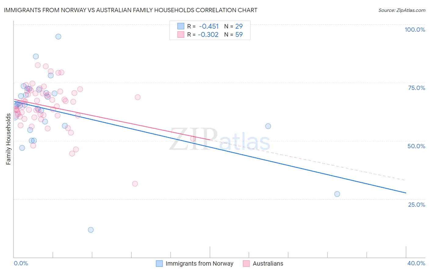
Immigrants from Norway vs Australian Family Households Correlation Chart
The statistical analysis conducted on geographies consisting of 116,686,104 people shows a moderate negative correlation between the proportion of Immigrants from Norway and percentage of family households in the United States with a correlation coefficient (R) of -0.451 and weighted average of 62.1%. Similarly, the statistical analysis conducted on geographies consisting of 224,034,220 people shows a mild negative correlation between the proportion of Australians and percentage of family households in the United States with a correlation coefficient (R) of -0.302 and weighted average of 62.8%, a difference of 1.2%.
Family Households Correlation Summary
| Measurement | Immigrants from Norway | Australian |
| Minimum | 11.8% | 31.6% |
| Maximum | 94.8% | 82.4% |
| Range | 83.1% | 50.9% |
| Mean | 62.9% | 64.8% |
| Median | 65.4% | 64.9% |
| Interquartile 25% (IQ1) | 56.4% | 60.9% |
| Interquartile 75% (IQ3) | 71.3% | 70.5% |
| Interquartile Range (IQR) | 14.9% | 9.6% |
| Standard Deviation (Sample) | 15.9% | 9.3% |
| Standard Deviation (Population) | 15.6% | 9.2% |
Similar Demographics by Family Households
Demographics Similar to Immigrants from Norway by Family Households
In terms of family households, the demographic groups most similar to Immigrants from Norway are Chippewa (62.1%, a difference of 0.0%), Subsaharan African (62.1%, a difference of 0.050%), African (62.1%, a difference of 0.080%), Bermudan (62.2%, a difference of 0.10%), and Immigrants from Liberia (62.0%, a difference of 0.10%).
| Demographics | Rating | Rank | Family Households |
| Immigrants | Africa | 0.0 /100 | #300 | Tragic 62.4% |
| Immigrants | Albania | 0.0 /100 | #301 | Tragic 62.4% |
| Immigrants | Kenya | 0.0 /100 | #302 | Tragic 62.3% |
| Cree | 0.0 /100 | #303 | Tragic 62.3% |
| Iroquois | 0.0 /100 | #304 | Tragic 62.2% |
| Bermudans | 0.0 /100 | #305 | Tragic 62.2% |
| Africans | 0.0 /100 | #306 | Tragic 62.1% |
| Immigrants | Norway | 0.0 /100 | #307 | Tragic 62.1% |
| Chippewa | 0.0 /100 | #308 | Tragic 62.1% |
| Sub-Saharan Africans | 0.0 /100 | #309 | Tragic 62.1% |
| Immigrants | Liberia | 0.0 /100 | #310 | Tragic 62.0% |
| Immigrants | Morocco | 0.0 /100 | #311 | Tragic 62.0% |
| Immigrants | Latvia | 0.0 /100 | #312 | Tragic 62.0% |
| Liberians | 0.0 /100 | #313 | Tragic 62.0% |
| Immigrants | Cabo Verde | 0.0 /100 | #314 | Tragic 61.9% |
Demographics Similar to Australians by Family Households
In terms of family households, the demographic groups most similar to Australians are Immigrants from Denmark (62.9%, a difference of 0.040%), New Zealander (62.9%, a difference of 0.050%), Estonian (62.9%, a difference of 0.080%), Mongolian (62.8%, a difference of 0.10%), and British West Indian (62.8%, a difference of 0.13%).
| Demographics | Rating | Rank | Family Households |
| Ottawa | 0.3 /100 | #277 | Tragic 63.0% |
| Immigrants | Belgium | 0.2 /100 | #278 | Tragic 63.0% |
| Immigrants | Yemen | 0.2 /100 | #279 | Tragic 63.0% |
| Immigrants | Bulgaria | 0.2 /100 | #280 | Tragic 63.0% |
| Estonians | 0.2 /100 | #281 | Tragic 62.9% |
| New Zealanders | 0.1 /100 | #282 | Tragic 62.9% |
| Immigrants | Denmark | 0.1 /100 | #283 | Tragic 62.9% |
| Australians | 0.1 /100 | #284 | Tragic 62.8% |
| Mongolians | 0.1 /100 | #285 | Tragic 62.8% |
| British West Indians | 0.1 /100 | #286 | Tragic 62.8% |
| Latvians | 0.1 /100 | #287 | Tragic 62.8% |
| Immigrants | Uganda | 0.1 /100 | #288 | Tragic 62.7% |
| Immigrants | Nepal | 0.1 /100 | #289 | Tragic 62.7% |
| Immigrants | Grenada | 0.0 /100 | #290 | Tragic 62.6% |
| U.S. Virgin Islanders | 0.0 /100 | #291 | Tragic 62.6% |