Immigrants from Afghanistan vs Immigrants from Africa Professional Degree
COMPARE
Immigrants from Afghanistan
Immigrants from Africa
Professional Degree
Professional Degree Comparison
Immigrants from Afghanistan
Immigrants from Africa
4.5%
PROFESSIONAL DEGREE
59.2/ 100
METRIC RATING
167th/ 347
METRIC RANK
4.6%
PROFESSIONAL DEGREE
72.5/ 100
METRIC RATING
152nd/ 347
METRIC RANK
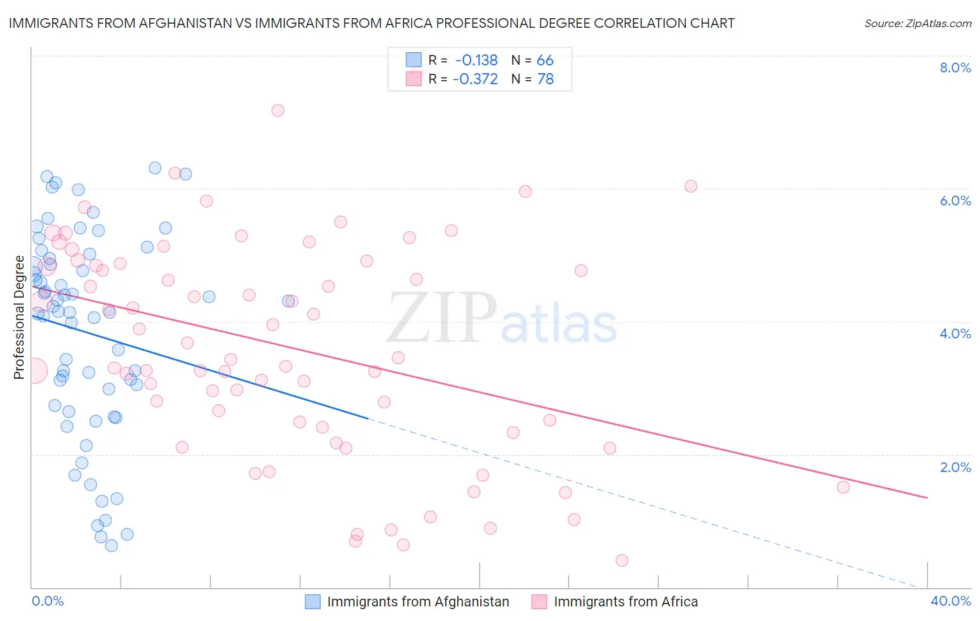
Immigrants from Afghanistan vs Immigrants from Africa Professional Degree Correlation Chart
The statistical analysis conducted on geographies consisting of 147,614,795 people shows a poor negative correlation between the proportion of Immigrants from Afghanistan and percentage of population with at least professional degree education in the United States with a correlation coefficient (R) of -0.138 and weighted average of 4.5%. Similarly, the statistical analysis conducted on geographies consisting of 467,878,515 people shows a mild negative correlation between the proportion of Immigrants from Africa and percentage of population with at least professional degree education in the United States with a correlation coefficient (R) of -0.372 and weighted average of 4.6%, a difference of 2.1%.
Professional Degree Correlation Summary
| Measurement | Immigrants from Afghanistan | Immigrants from Africa |
| Minimum | 0.62% | 0.40% |
| Maximum | 6.3% | 7.7% |
| Range | 5.7% | 7.3% |
| Mean | 3.8% | 3.6% |
| Median | 4.1% | 3.4% |
| Interquartile 25% (IQ1) | 2.7% | 2.4% |
| Interquartile 75% (IQ3) | 5.0% | 4.9% |
| Interquartile Range (IQR) | 2.2% | 2.5% |
| Standard Deviation (Sample) | 1.5% | 1.7% |
| Standard Deviation (Population) | 1.5% | 1.6% |
Demographics Similar to Immigrants from Afghanistan and Immigrants from Africa by Professional Degree
In terms of professional degree, the demographic groups most similar to Immigrants from Afghanistan are Immigrants from Colombia (4.5%, a difference of 0.030%), Immigrants from Sierra Leone (4.5%, a difference of 0.070%), Chinese (4.5%, a difference of 0.080%), Costa Rican (4.5%, a difference of 0.11%), and Swiss (4.5%, a difference of 0.27%). Similarly, the demographic groups most similar to Immigrants from Africa are Immigrants from Uruguay (4.6%, a difference of 0.0%), Polish (4.6%, a difference of 0.010%), Scottish (4.6%, a difference of 0.12%), Immigrants from Oceania (4.6%, a difference of 0.15%), and Slavic (4.5%, a difference of 0.30%).
| Demographics | Rating | Rank | Professional Degree |
| Senegalese | 75.3 /100 | #149 | Good 4.6% |
| Immigrants | Oceania | 73.4 /100 | #150 | Good 4.6% |
| Poles | 72.6 /100 | #151 | Good 4.6% |
| Immigrants | Africa | 72.5 /100 | #152 | Good 4.6% |
| Immigrants | Uruguay | 72.5 /100 | #153 | Good 4.6% |
| Scottish | 71.8 /100 | #154 | Good 4.6% |
| Slavs | 70.8 /100 | #155 | Good 4.5% |
| Swedes | 69.9 /100 | #156 | Good 4.5% |
| Iraqis | 69.8 /100 | #157 | Good 4.5% |
| Immigrants | Armenia | 68.8 /100 | #158 | Good 4.5% |
| Vietnamese | 68.4 /100 | #159 | Good 4.5% |
| Immigrants | Senegal | 68.0 /100 | #160 | Good 4.5% |
| Assyrians/Chaldeans/Syriacs | 67.4 /100 | #161 | Good 4.5% |
| Peruvians | 65.2 /100 | #162 | Good 4.5% |
| Sierra Leoneans | 64.3 /100 | #163 | Good 4.5% |
| Swiss | 61.0 /100 | #164 | Good 4.5% |
| Costa Ricans | 59.9 /100 | #165 | Average 4.5% |
| Immigrants | Colombia | 59.4 /100 | #166 | Average 4.5% |
| Immigrants | Afghanistan | 59.2 /100 | #167 | Average 4.5% |
| Immigrants | Sierra Leone | 58.7 /100 | #168 | Average 4.5% |
| Chinese | 58.6 /100 | #169 | Average 4.5% |