Immigrants from Afghanistan vs Black/African American Single Mother Households
COMPARE
Immigrants from Afghanistan
Black/African American
Single Mother Households
Single Mother Households Comparison
Immigrants from Afghanistan
Blacks/African Americans
6.5%
SINGLE MOTHER HOUSEHOLDS
24.7/ 100
METRIC RATING
187th/ 347
METRIC RANK
9.0%
SINGLE MOTHER HOUSEHOLDS
0.0/ 100
METRIC RATING
339th/ 347
METRIC RANK
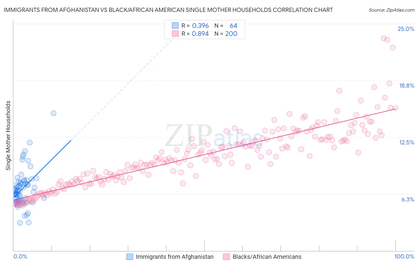
Immigrants from Afghanistan vs Black/African American Single Mother Households Correlation Chart
The statistical analysis conducted on geographies consisting of 147,513,852 people shows a mild positive correlation between the proportion of Immigrants from Afghanistan and percentage of single mother households in the United States with a correlation coefficient (R) of 0.396 and weighted average of 6.5%. Similarly, the statistical analysis conducted on geographies consisting of 561,713,889 people shows a very strong positive correlation between the proportion of Blacks/African Americans and percentage of single mother households in the United States with a correlation coefficient (R) of 0.894 and weighted average of 9.0%, a difference of 38.2%.
Single Mother Households Correlation Summary
| Measurement | Immigrants from Afghanistan | Black/African American |
| Minimum | 3.1% | 5.1% |
| Maximum | 15.1% | 23.4% |
| Range | 12.1% | 18.3% |
| Mean | 6.8% | 10.6% |
| Median | 6.6% | 10.4% |
| Interquartile 25% (IQ1) | 5.5% | 8.1% |
| Interquartile 75% (IQ3) | 7.6% | 12.5% |
| Interquartile Range (IQR) | 2.1% | 4.4% |
| Standard Deviation (Sample) | 2.1% | 3.3% |
| Standard Deviation (Population) | 2.0% | 3.2% |
Similar Demographics by Single Mother Households
Demographics Similar to Immigrants from Afghanistan by Single Mother Households
In terms of single mother households, the demographic groups most similar to Immigrants from Afghanistan are Costa Rican (6.5%, a difference of 0.020%), Ugandan (6.5%, a difference of 0.13%), Ottawa (6.5%, a difference of 0.13%), Ethiopian (6.5%, a difference of 0.19%), and Delaware (6.5%, a difference of 0.20%).
| Demographics | Rating | Rank | Single Mother Households |
| Immigrants | Nepal | 36.1 /100 | #180 | Fair 6.4% |
| Spanish | 33.4 /100 | #181 | Fair 6.4% |
| South American Indians | 33.4 /100 | #182 | Fair 6.4% |
| Spaniards | 27.8 /100 | #183 | Fair 6.5% |
| Ethiopians | 26.0 /100 | #184 | Fair 6.5% |
| Ugandans | 25.6 /100 | #185 | Fair 6.5% |
| Costa Ricans | 24.8 /100 | #186 | Fair 6.5% |
| Immigrants | Afghanistan | 24.7 /100 | #187 | Fair 6.5% |
| Ottawa | 23.8 /100 | #188 | Fair 6.5% |
| Delaware | 23.3 /100 | #189 | Fair 6.5% |
| Peruvians | 21.6 /100 | #190 | Fair 6.5% |
| Samoans | 21.2 /100 | #191 | Fair 6.5% |
| Americans | 19.0 /100 | #192 | Poor 6.6% |
| Colombians | 18.3 /100 | #193 | Poor 6.6% |
| Immigrants | Uganda | 18.3 /100 | #194 | Poor 6.6% |
Demographics Similar to Blacks/African Americans by Single Mother Households
In terms of single mother households, the demographic groups most similar to Blacks/African Americans are Lumbee (9.1%, a difference of 1.2%), Cape Verdean (8.9%, a difference of 1.5%), Tohono O'odham (9.1%, a difference of 1.6%), Navajo (8.8%, a difference of 1.7%), and Menominee (9.2%, a difference of 1.9%).
| Demographics | Rating | Rank | Single Mother Households |
| U.S. Virgin Islanders | 0.0 /100 | #332 | Tragic 8.6% |
| Liberians | 0.0 /100 | #333 | Tragic 8.6% |
| Immigrants | Liberia | 0.0 /100 | #334 | Tragic 8.7% |
| Immigrants | Dominica | 0.0 /100 | #335 | Tragic 8.7% |
| Puerto Ricans | 0.0 /100 | #336 | Tragic 8.7% |
| Navajo | 0.0 /100 | #337 | Tragic 8.8% |
| Cape Verdeans | 0.0 /100 | #338 | Tragic 8.9% |
| Blacks/African Americans | 0.0 /100 | #339 | Tragic 9.0% |
| Lumbee | 0.0 /100 | #340 | Tragic 9.1% |
| Tohono O'odham | 0.0 /100 | #341 | Tragic 9.1% |
| Menominee | 0.0 /100 | #342 | Tragic 9.2% |
| Dominicans | 0.0 /100 | #343 | Tragic 9.2% |
| Immigrants | Dominican Republic | 0.0 /100 | #344 | Tragic 9.5% |
| Immigrants | Cabo Verde | 0.0 /100 | #345 | Tragic 9.6% |
| Yuman | 0.0 /100 | #346 | Tragic 9.6% |