Immigrants from Nicaragua vs New Zealander Unemployment Among Ages 60 to 64 years
COMPARE
Immigrants from Nicaragua
New Zealander
Unemployment Among Ages 60 to 64 years
Unemployment Among Ages 60 to 64 years Comparison
Immigrants from Nicaragua
New Zealanders
4.9%
UNEMPLOYMENT AMONG AGES 60 TO 64 YEARS
29.8/ 100
METRIC RATING
189th/ 347
METRIC RANK
4.9%
UNEMPLOYMENT AMONG AGES 60 TO 64 YEARS
17.4/ 100
METRIC RATING
206th/ 347
METRIC RANK
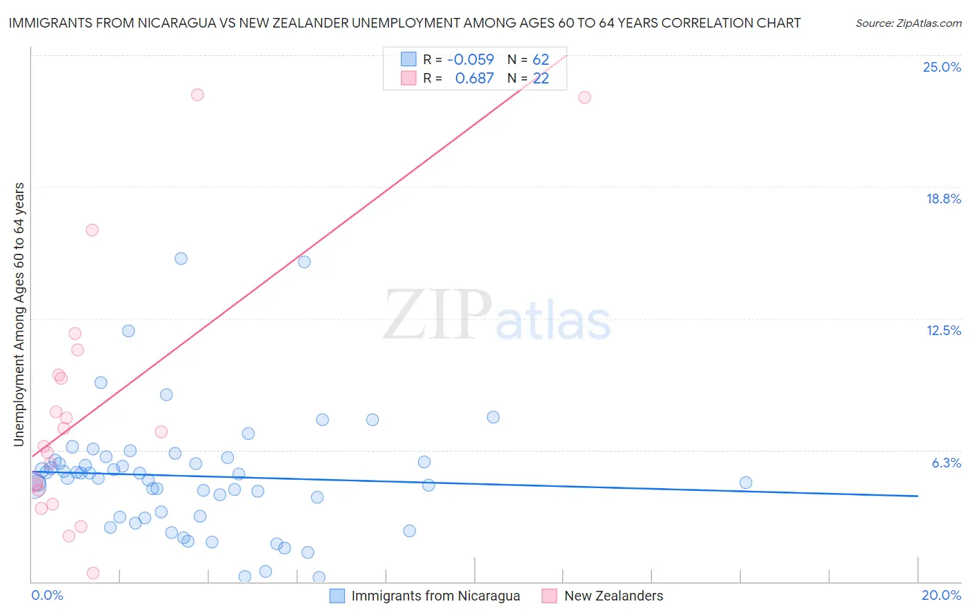
Immigrants from Nicaragua vs New Zealander Unemployment Among Ages 60 to 64 years Correlation Chart
The statistical analysis conducted on geographies consisting of 225,176,702 people shows a slight negative correlation between the proportion of Immigrants from Nicaragua and unemployment rate among population between the ages 60 and 64 in the United States with a correlation coefficient (R) of -0.059 and weighted average of 4.9%. Similarly, the statistical analysis conducted on geographies consisting of 102,928,930 people shows a significant positive correlation between the proportion of New Zealanders and unemployment rate among population between the ages 60 and 64 in the United States with a correlation coefficient (R) of 0.687 and weighted average of 4.9%, a difference of 0.61%.
Unemployment Among Ages 60 to 64 years Correlation Summary
| Measurement | Immigrants from Nicaragua | New Zealander |
| Minimum | 0.20% | 0.40% |
| Maximum | 15.3% | 23.1% |
| Range | 15.1% | 22.7% |
| Mean | 5.0% | 8.2% |
| Median | 5.0% | 6.8% |
| Interquartile 25% (IQ1) | 3.1% | 4.3% |
| Interquartile 75% (IQ3) | 5.8% | 9.8% |
| Interquartile Range (IQR) | 2.7% | 5.5% |
| Standard Deviation (Sample) | 2.9% | 6.0% |
| Standard Deviation (Population) | 2.8% | 5.9% |
Demographics Similar to Immigrants from Nicaragua and New Zealanders by Unemployment Among Ages 60 to 64 years
In terms of unemployment among ages 60 to 64 years, the demographic groups most similar to Immigrants from Nicaragua are Immigrants from Europe (4.9%, a difference of 0.0%), Immigrants from Nigeria (4.9%, a difference of 0.010%), Nicaraguan (4.9%, a difference of 0.020%), Menominee (4.9%, a difference of 0.040%), and South American Indian (4.9%, a difference of 0.060%). Similarly, the demographic groups most similar to New Zealanders are Immigrants from Indonesia (4.9%, a difference of 0.0%), Chippewa (4.9%, a difference of 0.010%), Russian (4.9%, a difference of 0.080%), Uruguayan (4.9%, a difference of 0.14%), and Immigrants from Western Africa (4.9%, a difference of 0.18%).
| Demographics | Rating | Rank | Unemployment Among Ages 60 to 64 years |
| South American Indians | 31.2 /100 | #187 | Fair 4.9% |
| Nicaraguans | 30.4 /100 | #188 | Fair 4.9% |
| Immigrants | Nicaragua | 29.8 /100 | #189 | Fair 4.9% |
| Immigrants | Europe | 29.8 /100 | #190 | Fair 4.9% |
| Immigrants | Nigeria | 29.6 /100 | #191 | Fair 4.9% |
| Menominee | 28.8 /100 | #192 | Fair 4.9% |
| Houma | 28.3 /100 | #193 | Fair 4.9% |
| Immigrants | Colombia | 26.8 /100 | #194 | Fair 4.9% |
| Immigrants | Austria | 26.6 /100 | #195 | Fair 4.9% |
| Immigrants | Asia | 25.7 /100 | #196 | Fair 4.9% |
| Immigrants | Eastern Europe | 25.2 /100 | #197 | Fair 4.9% |
| Guamanians/Chamorros | 23.7 /100 | #198 | Fair 4.9% |
| Immigrants | Vietnam | 23.7 /100 | #199 | Fair 4.9% |
| Immigrants | Czechoslovakia | 23.5 /100 | #200 | Fair 4.9% |
| Colombians | 22.7 /100 | #201 | Fair 4.9% |
| Immigrants | Western Africa | 20.6 /100 | #202 | Fair 4.9% |
| Uruguayans | 19.9 /100 | #203 | Poor 4.9% |
| Russians | 18.9 /100 | #204 | Poor 4.9% |
| Immigrants | Indonesia | 17.4 /100 | #205 | Poor 4.9% |
| New Zealanders | 17.4 /100 | #206 | Poor 4.9% |
| Chippewa | 17.3 /100 | #207 | Poor 4.9% |