Immigrants from Africa vs Slavic Family Households
COMPARE
Immigrants from Africa
Slavic
Family Households
Family Households Comparison
Immigrants from Africa
Slavs
62.4%
FAMILY HOUSEHOLDS
0.0/ 100
METRIC RATING
300th/ 347
METRIC RANK
64.0%
FAMILY HOUSEHOLDS
18.6/ 100
METRIC RATING
199th/ 347
METRIC RANK
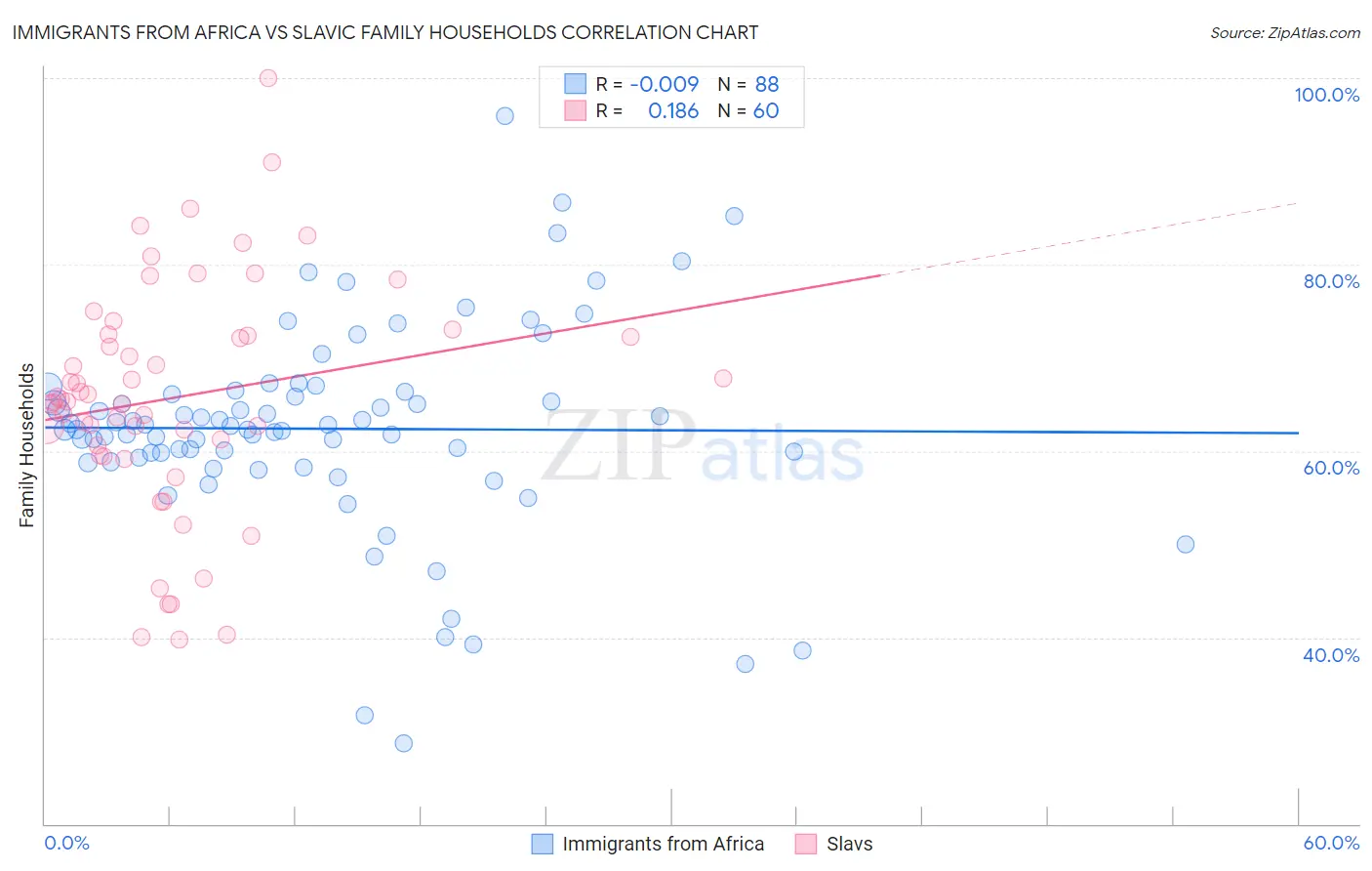
Immigrants from Africa vs Slavic Family Households Correlation Chart
The statistical analysis conducted on geographies consisting of 468,955,500 people shows no correlation between the proportion of Immigrants from Africa and percentage of family households in the United States with a correlation coefficient (R) of -0.009 and weighted average of 62.4%. Similarly, the statistical analysis conducted on geographies consisting of 270,816,335 people shows a poor positive correlation between the proportion of Slavs and percentage of family households in the United States with a correlation coefficient (R) of 0.186 and weighted average of 64.0%, a difference of 2.6%.
Family Households Correlation Summary
| Measurement | Immigrants from Africa | Slavic |
| Minimum | 28.7% | 39.7% |
| Maximum | 96.0% | 100.0% |
| Range | 67.3% | 60.3% |
| Mean | 62.4% | 65.7% |
| Median | 62.5% | 65.4% |
| Interquartile 25% (IQ1) | 59.1% | 60.1% |
| Interquartile 75% (IQ3) | 66.2% | 72.4% |
| Interquartile Range (IQR) | 7.2% | 12.4% |
| Standard Deviation (Sample) | 11.2% | 12.5% |
| Standard Deviation (Population) | 11.1% | 12.4% |
Similar Demographics by Family Households
Demographics Similar to Immigrants from Africa by Family Households
In terms of family households, the demographic groups most similar to Immigrants from Africa are Immigrants from Kuwait (62.4%, a difference of 0.0%), Immigrants from Albania (62.4%, a difference of 0.020%), Immigrants from Kenya (62.3%, a difference of 0.060%), Immigrants from Spain (62.4%, a difference of 0.070%), and French American Indian (62.4%, a difference of 0.090%).
| Demographics | Rating | Rank | Family Households |
| Immigrants | Sweden | 0.0 /100 | #293 | Tragic 62.5% |
| Barbadians | 0.0 /100 | #294 | Tragic 62.5% |
| Okinawans | 0.0 /100 | #295 | Tragic 62.5% |
| Slovenes | 0.0 /100 | #296 | Tragic 62.4% |
| French American Indians | 0.0 /100 | #297 | Tragic 62.4% |
| Immigrants | Spain | 0.0 /100 | #298 | Tragic 62.4% |
| Immigrants | Kuwait | 0.0 /100 | #299 | Tragic 62.4% |
| Immigrants | Africa | 0.0 /100 | #300 | Tragic 62.4% |
| Immigrants | Albania | 0.0 /100 | #301 | Tragic 62.4% |
| Immigrants | Kenya | 0.0 /100 | #302 | Tragic 62.3% |
| Cree | 0.0 /100 | #303 | Tragic 62.3% |
| Iroquois | 0.0 /100 | #304 | Tragic 62.2% |
| Bermudans | 0.0 /100 | #305 | Tragic 62.2% |
| Africans | 0.0 /100 | #306 | Tragic 62.1% |
| Immigrants | Norway | 0.0 /100 | #307 | Tragic 62.1% |
Demographics Similar to Slavs by Family Households
In terms of family households, the demographic groups most similar to Slavs are Immigrants from Canada (64.0%, a difference of 0.010%), Seminole (64.0%, a difference of 0.010%), Polish (64.0%, a difference of 0.010%), Immigrants from Malaysia (64.0%, a difference of 0.020%), and Immigrants from North America (64.0%, a difference of 0.030%).
| Demographics | Rating | Rank | Family Households |
| Lithuanians | 23.8 /100 | #192 | Fair 64.0% |
| French | 23.7 /100 | #193 | Fair 64.0% |
| Paiute | 22.2 /100 | #194 | Fair 64.0% |
| Immigrants | North America | 20.0 /100 | #195 | Poor 64.0% |
| Immigrants | Canada | 19.2 /100 | #196 | Poor 64.0% |
| Seminole | 18.9 /100 | #197 | Poor 64.0% |
| Poles | 18.9 /100 | #198 | Poor 64.0% |
| Slavs | 18.6 /100 | #199 | Poor 64.0% |
| Immigrants | Malaysia | 17.9 /100 | #200 | Poor 64.0% |
| Immigrants | Eastern Europe | 17.2 /100 | #201 | Poor 64.0% |
| Iranians | 13.5 /100 | #202 | Poor 63.9% |
| Norwegians | 13.2 /100 | #203 | Poor 63.9% |
| Immigrants | Uruguay | 12.8 /100 | #204 | Poor 63.9% |
| Brazilians | 12.4 /100 | #205 | Poor 63.9% |
| Immigrants | Lithuania | 12.1 /100 | #206 | Poor 63.9% |