Immigrants from Pakistan vs Immigrants from Africa Female Unemployment
COMPARE
Immigrants from Pakistan
Immigrants from Africa
Female Unemployment
Female Unemployment Comparison
Immigrants from Pakistan
Immigrants from Africa
5.2%
FEMALE UNEMPLOYMENT
66.7/ 100
METRIC RATING
161st/ 347
METRIC RANK
5.4%
FEMALE UNEMPLOYMENT
8.5/ 100
METRIC RATING
220th/ 347
METRIC RANK
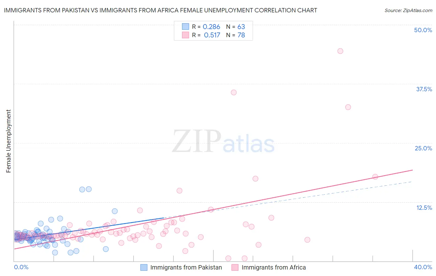
Immigrants from Pakistan vs Immigrants from Africa Female Unemployment Correlation Chart
The statistical analysis conducted on geographies consisting of 283,425,131 people shows a weak positive correlation between the proportion of Immigrants from Pakistan and unemploymnet rate among females in the United States with a correlation coefficient (R) of 0.286 and weighted average of 5.2%. Similarly, the statistical analysis conducted on geographies consisting of 466,538,458 people shows a substantial positive correlation between the proportion of Immigrants from Africa and unemploymnet rate among females in the United States with a correlation coefficient (R) of 0.517 and weighted average of 5.4%, a difference of 4.6%.
Female Unemployment Correlation Summary
| Measurement | Immigrants from Pakistan | Immigrants from Africa |
| Minimum | 1.8% | 0.60% |
| Maximum | 15.2% | 44.4% |
| Range | 13.4% | 43.8% |
| Mean | 5.4% | 7.5% |
| Median | 5.0% | 5.8% |
| Interquartile 25% (IQ1) | 4.4% | 5.2% |
| Interquartile 75% (IQ3) | 5.8% | 7.4% |
| Interquartile Range (IQR) | 1.4% | 2.2% |
| Standard Deviation (Sample) | 2.3% | 6.7% |
| Standard Deviation (Population) | 2.3% | 6.7% |
Similar Demographics by Female Unemployment
Demographics Similar to Immigrants from Pakistan by Female Unemployment
In terms of female unemployment, the demographic groups most similar to Immigrants from Pakistan are Immigrants from Spain (5.2%, a difference of 0.0%), Immigrants from Micronesia (5.2%, a difference of 0.010%), Potawatomi (5.2%, a difference of 0.050%), Albanian (5.2%, a difference of 0.11%), and Immigrants from Asia (5.2%, a difference of 0.16%).
| Demographics | Rating | Rank | Female Unemployment |
| South Africans | 70.8 /100 | #154 | Good 5.2% |
| Immigrants | Egypt | 70.0 /100 | #155 | Good 5.2% |
| Immigrants | Northern Africa | 69.6 /100 | #156 | Good 5.2% |
| Immigrants | Russia | 69.3 /100 | #157 | Good 5.2% |
| Albanians | 68.3 /100 | #158 | Good 5.2% |
| Immigrants | Micronesia | 66.9 /100 | #159 | Good 5.2% |
| Immigrants | Spain | 66.8 /100 | #160 | Good 5.2% |
| Immigrants | Pakistan | 66.7 /100 | #161 | Good 5.2% |
| Potawatomi | 65.9 /100 | #162 | Good 5.2% |
| Immigrants | Asia | 64.3 /100 | #163 | Good 5.2% |
| Bangladeshis | 64.3 /100 | #164 | Good 5.2% |
| Syrians | 62.8 /100 | #165 | Good 5.2% |
| Native Hawaiians | 62.7 /100 | #166 | Good 5.2% |
| Immigrants | Thailand | 62.1 /100 | #167 | Good 5.2% |
| Sri Lankans | 59.4 /100 | #168 | Average 5.2% |
Demographics Similar to Immigrants from Africa by Female Unemployment
In terms of female unemployment, the demographic groups most similar to Immigrants from Africa are South American (5.4%, a difference of 0.010%), Bermudan (5.4%, a difference of 0.090%), Peruvian (5.4%, a difference of 0.18%), Brazilian (5.5%, a difference of 0.25%), and Comanche (5.4%, a difference of 0.26%).
| Demographics | Rating | Rank | Female Unemployment |
| Samoans | 10.6 /100 | #213 | Poor 5.4% |
| Seminole | 10.3 /100 | #214 | Poor 5.4% |
| Immigrants | Nicaragua | 10.2 /100 | #215 | Poor 5.4% |
| Comanche | 10.0 /100 | #216 | Poor 5.4% |
| Peruvians | 9.6 /100 | #217 | Tragic 5.4% |
| Bermudans | 9.0 /100 | #218 | Tragic 5.4% |
| South Americans | 8.6 /100 | #219 | Tragic 5.4% |
| Immigrants | Africa | 8.5 /100 | #220 | Tragic 5.4% |
| Brazilians | 7.3 /100 | #221 | Tragic 5.5% |
| Nicaraguans | 7.2 /100 | #222 | Tragic 5.5% |
| Delaware | 7.2 /100 | #223 | Tragic 5.5% |
| Iraqis | 7.1 /100 | #224 | Tragic 5.5% |
| French American Indians | 6.1 /100 | #225 | Tragic 5.5% |
| Immigrants | Peru | 5.9 /100 | #226 | Tragic 5.5% |
| Immigrants | Philippines | 5.3 /100 | #227 | Tragic 5.5% |